Showing posts with label Advertising. Show all posts

Thursday, 3 December 2015

Inside Tending to Your Organisation, a Training Guide For All CEOs

A Bountiful Harvest: Promoting Diversified Thinking


Tending to Your Organisation is a training manual for managerial positions and frontline workers alike. It aims to segue a company's cultural competency in its workplace.

Over the course of two months, every team in class was tasked to create a comprehensive manual that'd be graded for an Organizational Communication module. Albeit a school project, professionalism was expected from every work members of the class produced. The individual manuals- based on a list of relevant topics pertaining to the said module- would then be pitched to a class who'd play an imagined audience (i.e. HR managers, CEOs). Its totality would be assessed based on one's understanding on the subject matter.

My team's pick was Cultural Competency, a study in one's aptitude across a cross-cultural setting. By proffering skills to readers to hone their own competency, the challenge was to underscore the manual's objectives and benefits to prospective clients in a presentation.

Challenge:

It's too narrow to limit culture to a language or a skin colour, according to anyone with the common wisdom to know of different races, ethnicities, and genders. The view on culture encompasses a wider set of examples. Personal experiences, values, beliefs, attitudes- culture can be summed as a way of how people lived, in brief. It is a worldview.

The challenge then, was to present its competency as a benefit to our clients' interest. Anyone who cares enough must be informed and persuaded to the benefits of a healthy workplace culture.

Insight:

Cultural competency isn't a bottom line that reaps monetary benefits, once mastered- nobody can guarantee that. Neither is it a problem like workplace conflict, which can be nipped by changing one's methods at absolving conflicted interests. However, if its ambiguous non-referent idea had a strategic posture, it'd be that cultural competency is a value. And like all values, cultural competency cannot be trained. It has to be aspired in people.

By equipping CEOs with an education, the values would, thus, cascade downward to all members of an organization. The objective was to create an open, trusting, and inclusive workplace culture.

Execution:

The manual- which could take on any form of presentation- was marketed as a guidebook.

And like all natural practices, one's company culture needs tending. The guidebook rules out the dogmatic prescriptions of telling CEOs what they should do with their own companies. Instead, it coaches them throughout various organizational phases, from the start- at the importance of a better hiring process- to the tail- once an employee has settled within the company.

Thusly, its title and successive chapters:

Tending to Your Organisation: A Guide to Honing Your Cultural Competency
A Budding Organisation


From Friction to Fruition: Managing Conflict Effectively


My role as team leader and copywriter was not only to materialize all members' ideas into its content, but also to buttress our pitch with copy for the promotional ads. We avoided the cliches of an emotional appeal (that meant no poverty porn or any exploitative tactics at the expense of the minority). Rather, targeted at CEOs, we wanted a strong voice of reason to speak for itself.

As a first part of a trio of simplistic ads, this is a double page spread written, and presented formally, to promote the training guide:

Enlarge to read text


Next, with an interest directed to our audience, who're all CEOs and leaders in their own stride, my team I made two OOH ads. We wanted the headlines to be concise, yet promising to its reach, with a bare-bone layout and clear message:


Finally, the highest stakeholder for our audience (What do CEOs want?) is, in fact, their own intended audience whereby company growth relies upon those relationships; their customers:

Enlarge to read text


Cultural competency is an opportunity.

Results:

Tending to Your Organization has earned my team and I high points for the content and its presentation format. We too, leagued amongst the top three of presentations, voted by populist choice. Although we were eventually won out by peers with their leisurely pitches, my team and I believe a pitch doesn't share the same name as a sketch. We leaned our sales message- without the fat.

Thursday, 8 October 2015

Why Hedi Slimane is The Most Important Designer in Fashion Right Now.


Californian-based Parisian designer Hedi Slimane is having a fashion moment right now at Saint Laurent, a post he's helmed creative director since 2012. "He's a genius," said Betty Catroux, a confidante and muse to the late designer Yves Saint Laurent. Indeed, Slimane has, in a span of three years, rebooted the label, dropped its first name, courted controversy (though, unwittingly), and skyrocketed Saint Laurent's sales since it succeeded Stefano Pilati's romanticised embroidery of the label.

Stripped off of the high-fashion that designers before Slimane has struggled to restore into its company, Slimane's "genius" was to bring high street to the ideals of luxury. He has torn up and reassembled its parts again to resemble the wardrobe of a night-life streetwalker. Seasonally, Slimane's clothes were nothing of the glamour one'd wear, say, to Swan Lake, but an amalgamation of skinny jeans, army-surplus jackets and almost-air-tight mini skirts slit to the panties. All beside the girlish accessories he'd imagined for the new Saint Laurent girl- chokers, high-inch black stilettos and ripped stockings, Slimane's girl would rather jam to a Pearl Jam concert.


From commissioning runway music with his Los Angeles peers, to featuring Californian artists on his show invites, advertisers can agree Slimane's wizardry is marketing magic, grounded in collaboration. As for the clothes this season, Slimane riffed on the battered looks of festival goers with a musical reference. (Representative: Courtney Love).

Think Glastonbury and one'd flog to death about those Wellington boots he showed, alongside the slip dresses, which closed the show sans Love's tiara accessory- that the grunge rocker would don. In between, the show was not without the repetitive pieces of an everyday wardrobe, from sparkly dresses to perfecto leather jackets, and the netted tank tops that one can order, pronto, from NastyGal.


Crowning the girl with a tiara was also a deliberate choice. As the show opened under the haunting spell of musician John Dywer's soundtrack, an atmospheric number with repetitive beats that drummed on ad infinitum, models bowled down the catwalk from a black cube- a similar fashion to Larry Bell's featured cubic artwork this season. Their summer-of-love outfits, during which showed a collage of denim, furry shrugs, and immaculately tailored blazers, were accessorized with sparkle less on the feet than bijoux-ed on top of their heads, as if to scream, "f**k me, I'm famous," rung from the same rebellious bells of Courtney Love's kinder whore aesthetic. The prom queen this season is a champ of her own wardrobe, a point Slimane has been prodding when he first showed boots, instead of heels, oversized Nirvana-like plaid shirts, instead of dinner jackets, on his debut. It's no rocket science how easy these looks could be assimilated.

How has all that worked for a luxury business that prizes itself on the conceptual and operatic designs for close to a decade has less befuddled its audience than to scurry them to think alike; to reformulate their own strategies to follow suit. Slimane's influence is based on commerce and pure marketing, churning out easy-to-pair pieces that'd fit like a missing puzzle into his wearer's closet. You didn't know you wanted Wellington boots, and you didn't know they could be styled this or that way, until you watched a Saint Laurent presentation.

And his competitors are gradually etching on, with yet another old-house Courreges revitalising its codes this Paris Fashion week, with no complete looks but as to reintroduce variations of its famous jackets. Buyers would jump for joy, customers would find that easy to digest, and the appeal is right in line to fashion's new standard of purchase: See it, like it, wear it tomorrow.


Wednesday, 16 September 2015

Wieden + Kennedy's History of The Internet

When Kim Kardashian tried to balance a champagne glass on her a** for Paper Magazine in 2014, the "Internet broke", to say the least about going viral. However, it was less at the atrocity of the social media mogul- reigning in 46.2m followers since, among her peers- than at its admittance, that she has also come to define the Internet: total self-disclosure, partial-state-of-undress selfies, and depending how strong your WiFi connection is, a tool that has surveyed, governed, and changed our lives irrevocably.

Click image to enlarge.


What's interesting then is that global advertising agency Wieden + Kennedy has furthered this discourse. Appropriately, it has churned out a page-long response for the 20th Annual Webby Awards, as part of other 20 notable works, which include organizations like Tumblr, NASA, Google, and, even, creative agency Kinetic Singapore, whose influence has had a hand in shaping our future.

Instead of crowing about its benefits or embedding it with human stories that honour its genesis, Wieden + Kennedy has broached the topic in a free and interpretative way, by "objectively" putting the Internet in context with its enduring history. Noteworthy remarks, like sound bites from popular culture, are included as much as its impact to advertisers, a concern that has challenged marketers to rethink about ways to connect with its audiences.

Over the next 20 weeks, a host of ideas will start unfurling from various organisations in tandem with the theme, "The Internet Can't Be Stopped." It's almost retrospective to think that every company listed has touched our lives one way or another. What the Internet should then be to them will also be related in poster-sized prints.

Relevancy is what makes this campaign so inclusive and exciting to follow. "Self-destructing videos" points to Snapchat and "#FirstWorldProblems" is a quintessential millenial gripe. Let's just say the Internet has a long tedious background that will never see a clean slate.

Click image to enlarge.


Wednesday, 20 May 2015

12 Oz. of happiness to share


As AMC's Mad Men saw what was the end of an era last Sunday, viewers were reminded of what's to become of that era. That the golden age of advertising closed with a television spot, "I'd Like To Teach The World To Sing", belted a happy familiar tune that gathered international faces to celebrate, and to facilitate the drama's end into a present day nostalgia. That befitting performance was a Coke ad, and its brand message hasn't changed since because it's worked for more than an era.


Coke, or the "real thing", has been rallying its audience with positive messages since the early 70s (or 50s, if you're picky). Its secret formula isn't in its soda, but what's associated with. Running a history in the vein of happiness, its long withstanding brand presence that could have also turned on itself as an irony people collect over in its souvenirs- such as vintage poster ads or glass design bottles cleared out from flea markets, is an other formula of cleverness. One that Coke has constantly played on in pole position, instead of washing out like so many other American products we're only faintly aware of, if not unfamiliar with, from period dramas- such as with Mad Men. If it were not for its consistent tenor at keeping apace with people at large, globally, Coke's brand heritage and its continual success would not have witnessed its influence upon new, and niche audiences alike, today. Coke would not have been the proprietary brand of soda, in other words.

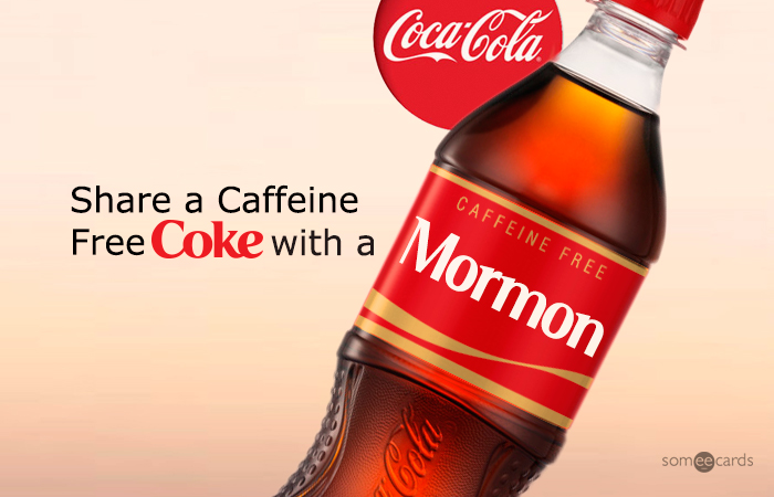
Share a Coke with somebody famous.


Today, Share a Coke, the latest of event marketing, is a viral hit. With Instagram, Twitter and Facebook reigning in an overwhelming response, it seemed not unlikely that people had to hop off the bandwagon before others hopped on. The campaign's results were tangible: You put a dollar (presumably) into the vending machine and, to skip the science, out pops a can at its most personal with your name printed on in the famous Spencerian-lookalike typeface- because originals are also an untouchable trademark issue. Touted the "You" font, Coke has drawn the attention away from itself and toward the happy consumer who's ready to guzzle all the happiness in 12 oz. of carbonated brown. On a personal level, that's ownership. You feel, as if made to coincide with the brand's mutual liking, that you have owned a piece of this conglomerate business.


Sparking a trend that has too been adopted by the scores of other global territories alike, such as Singapore and Europe, Coke has surprised in Mexico with bottles repackaged in braille for the blind, this time. At the outset, the new bottles are an extension of its earlier campaigns. While everything else remains aesthetically recognizable in the same distinctive swirls and fire-engine red, design modifications are a practical message targeted at a new group of audience: One that response-shapes the people's prosocial attitude. Headed by agency Anonimo, which has its hand prior in other Coke campaigns, this new strategy is a no-holds-barred approach, synonymous to the brand's continual message: To share a Coke with someone, in the wake of happiness.

A well played personal favourite.
More importantly, for a brand that has undertaken creative means to share happiness for more than a decade, it has certainly inspired. Reaping the rewards of Coke's latest efforts to connect and converse meaningfully, audiences have participated just as much in parody as with flippant responses- such as one above- from puns to private jokes, to becoming an instant memorabilia that prides on camp to reaffirm the brand as an object of desire on everyone's minds, once again.


Like every marketer's dream, that's always still a PR move well played.


Thursday, 7 May 2015

Give Good Ideas a Shot


We're fickle, demanding, and, at least when it comes to satisfying our shopping lists, unsettled. Even after distilling our items from a long line of ambiguous other in the supermarket, we still debate, question, and reevaluate one brand of milk compared to the next. In resolve, between a local home brand wrapped behind white anonymity and its renowned competitor, we instinctively navigate toward the sprightlier packaging, one that celebrates branding- in the wake of reassuring ourselves that we've also made an honest choice. (Representative: Greenfields.)

The same goes to selecting our liquor. Apropos of cinching this year's Best Packaging Award for Best Show, the Dieline Awards- an honorary to the world's best design packaging- has crowned a maritime-themed cocktail bar in Barcelona (Bar Pesca Salada) for its innovative bottle design: Fittingly, a visual game of a man rollicking in its spirit. Swerving away from typical shelf bottles advertising the same supreme age, its minimal brand advertising is, in this case, a refreshing sight for sore eyes when you're shopping in a place usually amassed with logos bordering offensive.


However, between you and your shot glasses, drinking is a serious affair; something not to be trifled with in the stuff's fervor. To feel reassured, we often put our money where the stamp is: In a distinctive approval from the product's heritage where no second tier ingredient can emulate. (It's not unlikely that competitors taste better, it's just that the former already looks better in taste.)
Unless, of course, everyone else promises the same damn thing.

In marketing speak, that could be brand saturation. (Hoorah!) In a consumer's mind, that's as tasting as water with a homogenous appeal (or a lack thereof, for that matter) that renders one brand from the next indistinguishable. And should everything taste as its packaging does, saturating its design packaging is equivalent to a sameness, a predictability: The same robust taste, or the same spicy notes tinkled with a needling pine flavor. Judging by how convenient and common it is to mark brand heritage across all liquor bottles, we wouldn't bother with brand packaging, in other words.

Winning a design packaging award for an illustrative definition of canoodling may, therefore, be a novel idea. But toying with it while you down the slow-burning taste of gin only makes it better, because the activity is never to be a dull one. It's a wayward impulse that should not chaste us to any old hand, like giving fresh ideas a shot (I mean it quite literally), or drinking it straight from the bottle like a sinkhole.